__
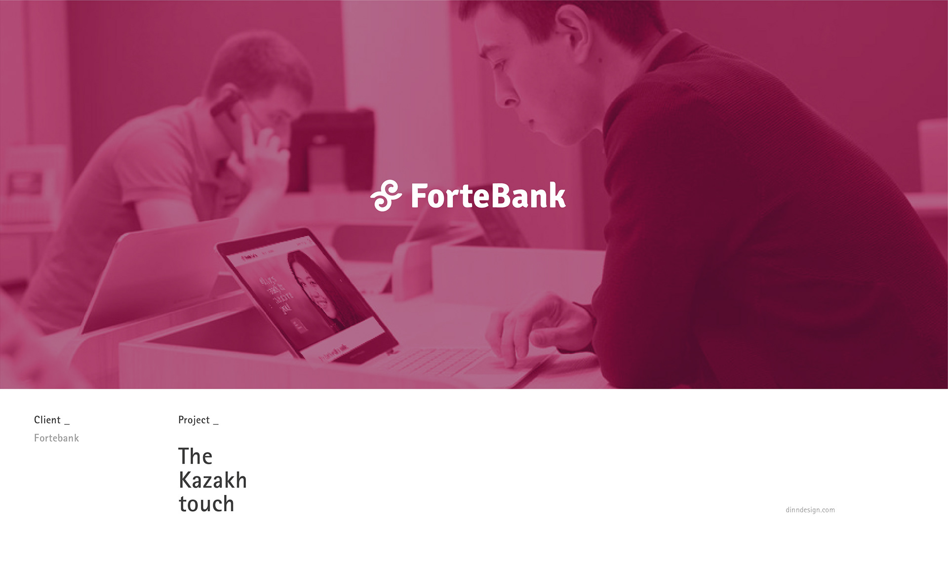
Fortebank - Kazakh Touch
brand identity and art direction
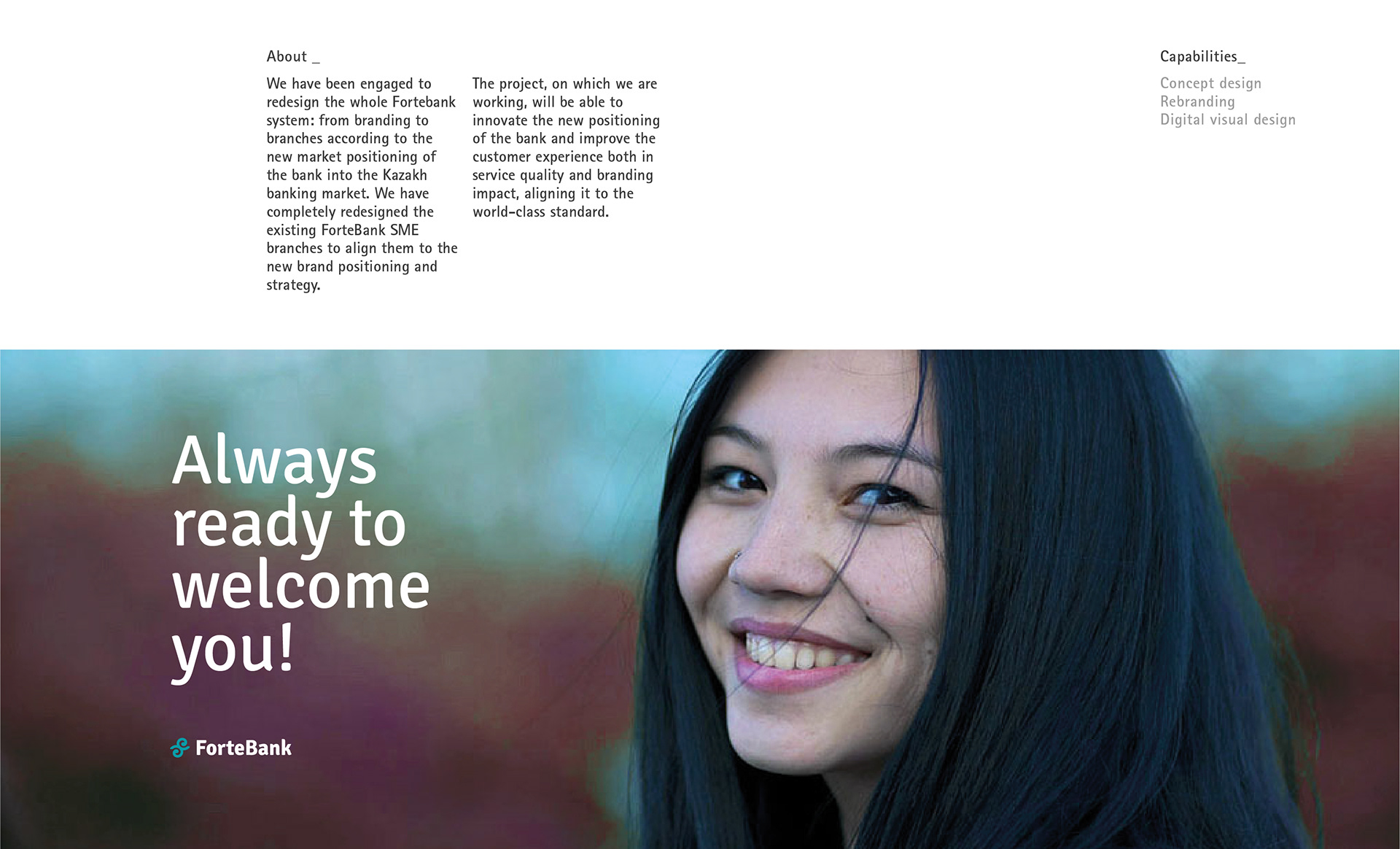
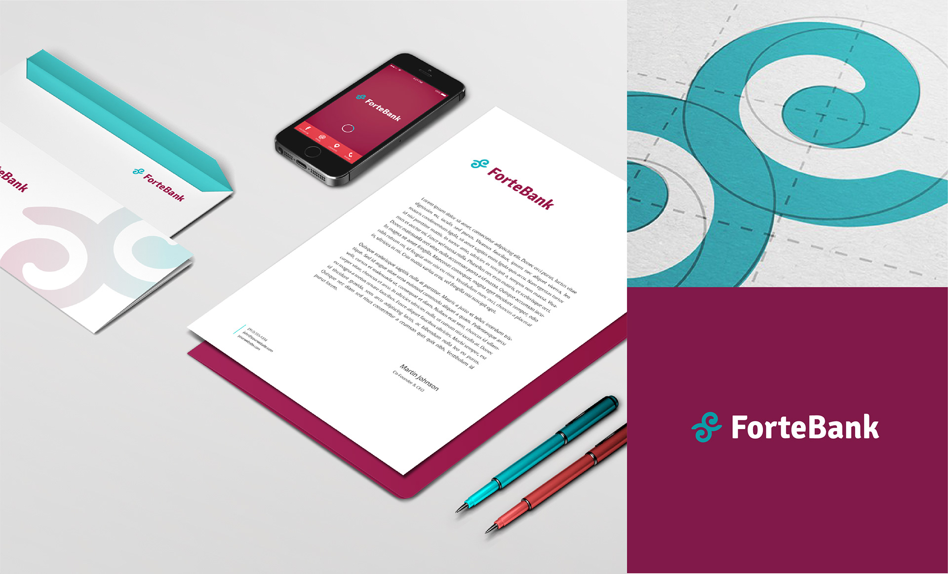
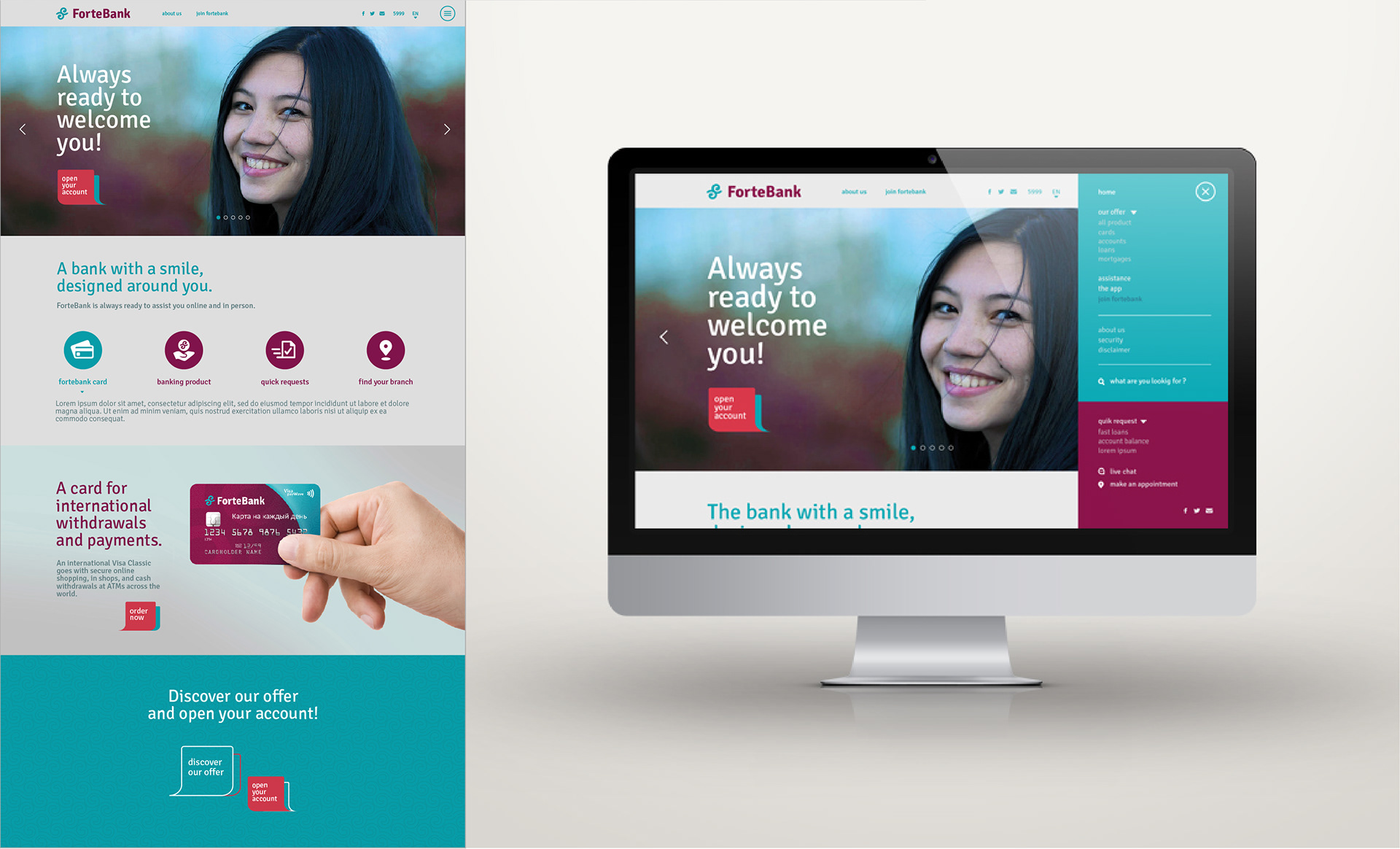
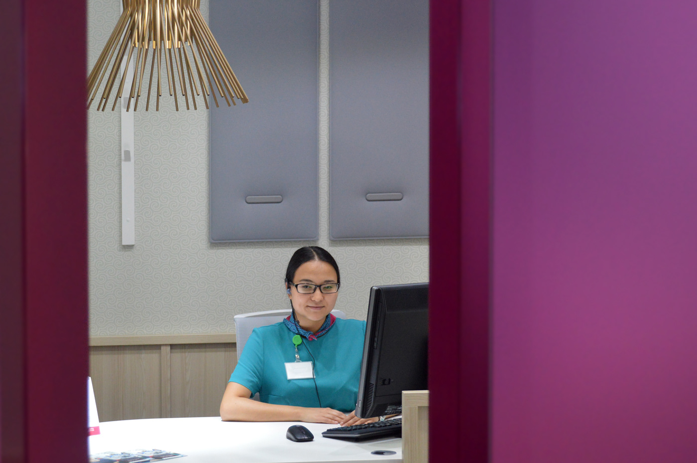
Three banks that join in one. This is the biggest merger ever in Kazakh banking market. The new ForteBank brand positioning is closer to people. It is immediately recognized and a real guide for its clients. The restyling safeguards the actual logotype identity, highlighting the Kazakh touch. It also reshapes the traditional sign conferring a leading-edge nature.
All the following design are 'DINN! srl copyright - dinndesign.com


__
designed with 'DINN! design studio - 2015
more information about this project at the following link
__
Thank you